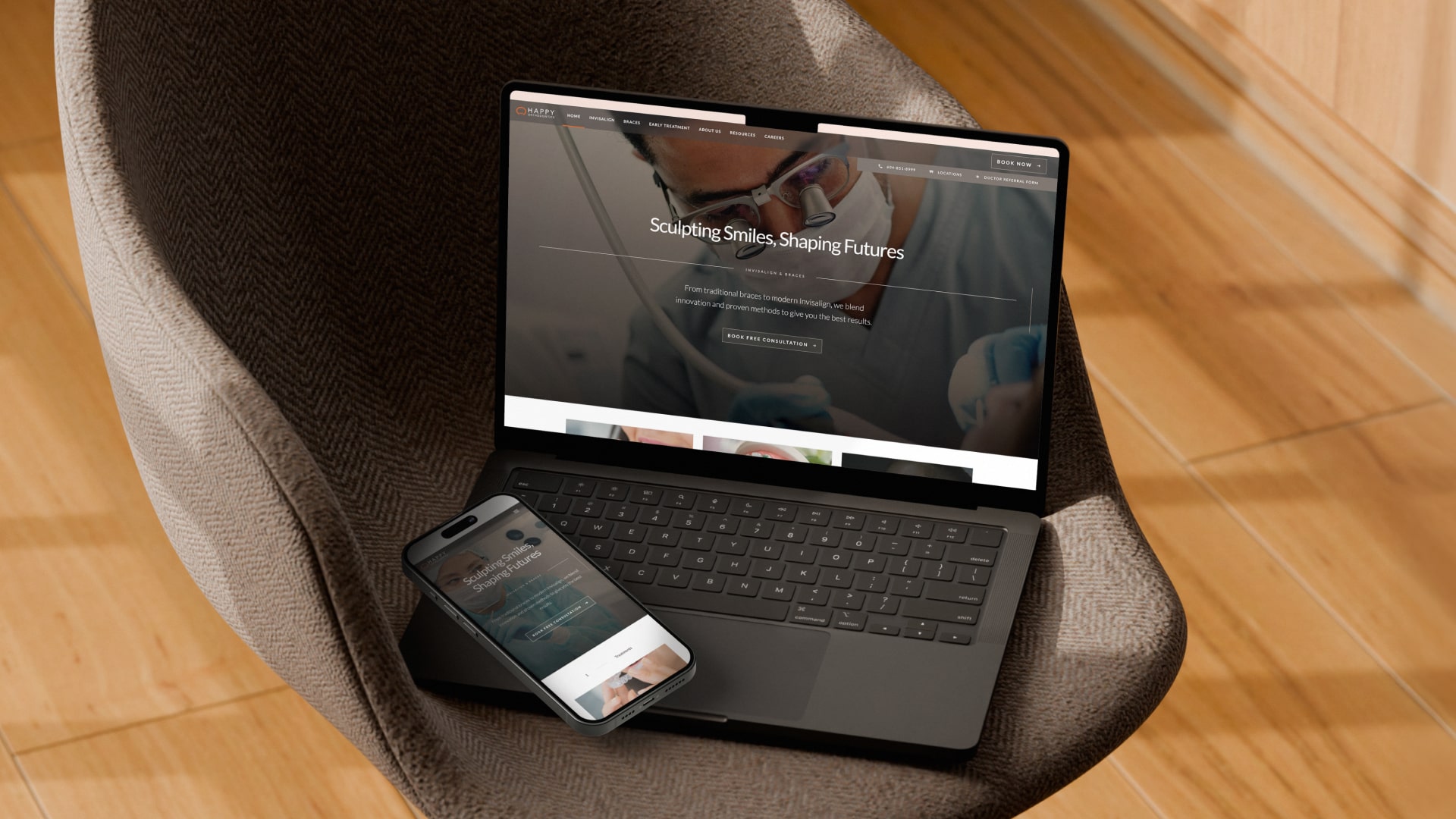
The Happy Orthodontics team was investing heavily in SEO and Google Ads, successfully generating strong traffic volumes to their website. To complement that effort, the website experience needed to be refreshed to effectively guide incoming users from Search → Book Consultation.From a UX/UI perspective, there were clear opportunity areas to improve immediately to get users progressing downfunnel:
When unpacking the overall customer journey with the client, it became clear that the in-person consultation experience and the website experience were not fully aligned. During consultations, patients are guided through detailed case examples and a clearly defined treatment process. Bringing that same depth of information forward digitally would allow users to vet the clinic more thoroughly and make a confident, informed decision before booking.
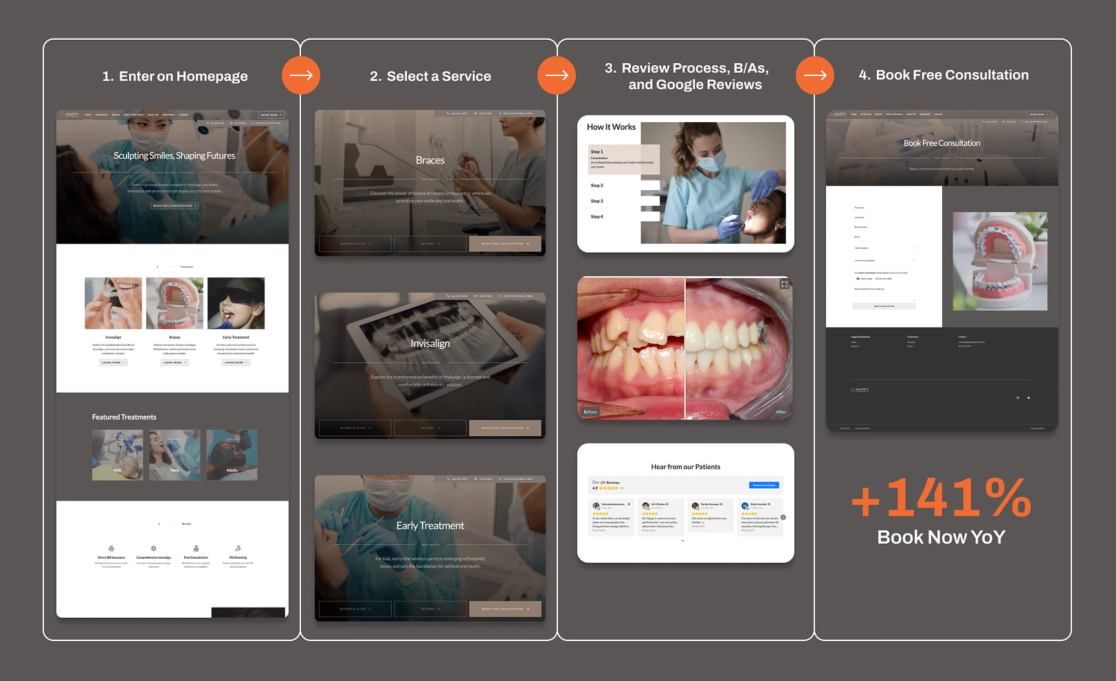
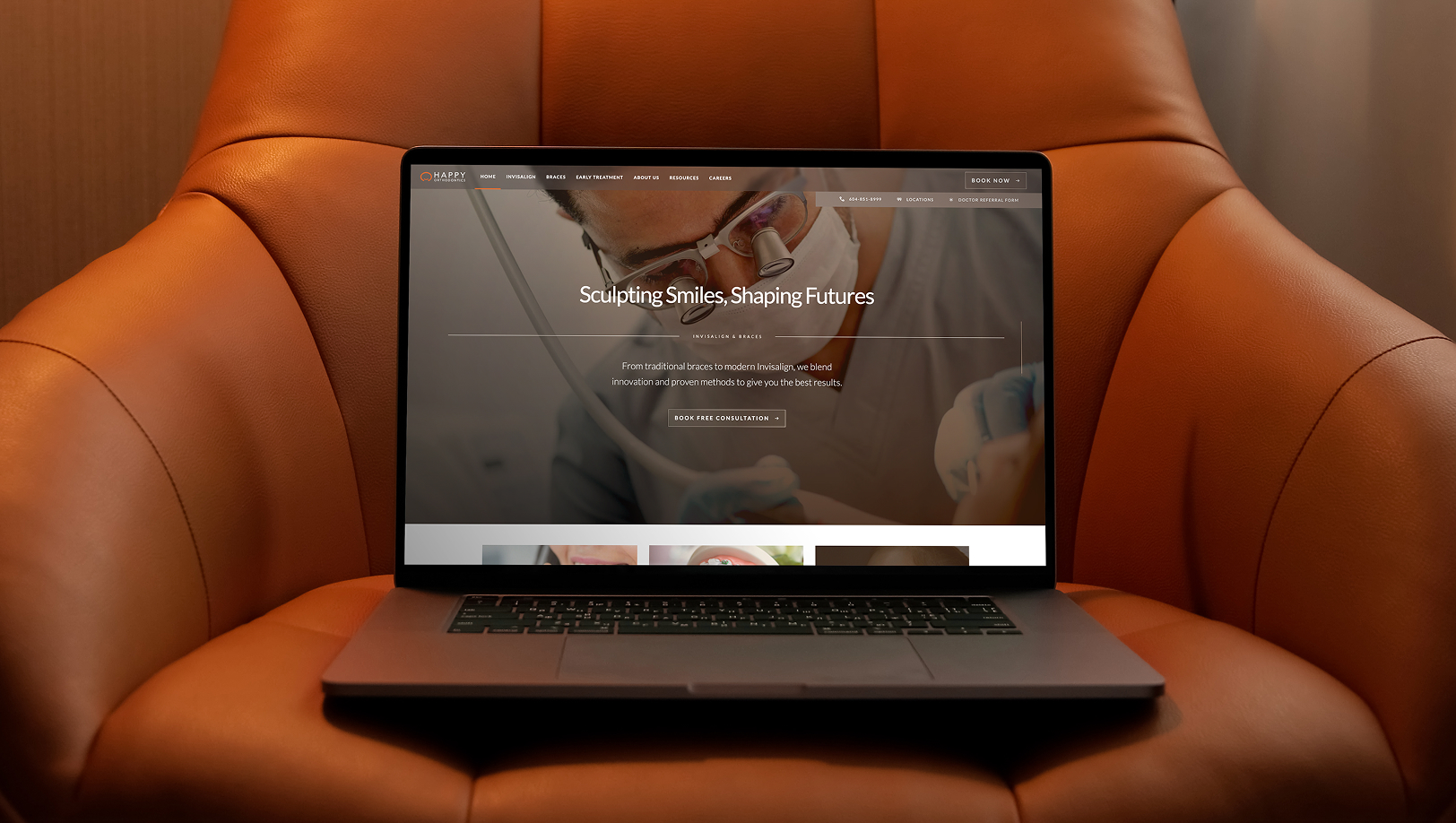
The objective was clear: mirror the in-person consultation experience into a digital journey that drives bookings.
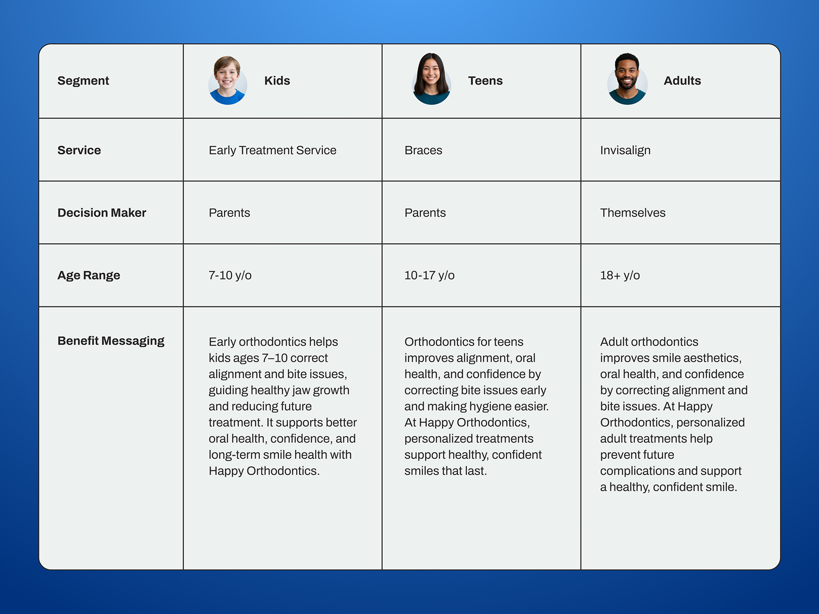
Following discovery, three core audience segments emerged: kids, teens, and adults. Each segment carried a different journey shaped by treatment type, duration, decision-maker involvement, budget considerations, and core value drivers. This segmentation informed messaging, page structure, and service recommendation so each audience could quickly identify themselves and understand the path forward.
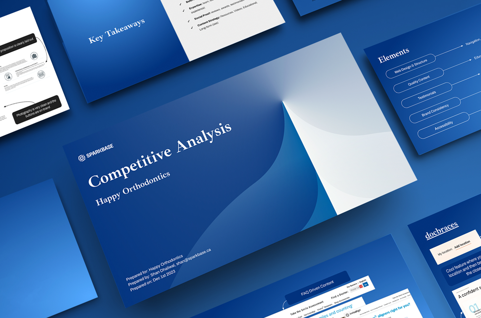
We assessed the external landscape by reviewing local competitors and leading orthodontic clinics internationally. This helped clarify positioning, messaging, and website journey structure, identifying where Happy Orthodontics could differentiate and compete more effectively from a website perspective.
A content audit was conducted to fully understand the existing structure, content relationships, and performance patterns before introducing a new architecture. The objective was simple: make informed decisions while preserving what was already working. This involved mapping all primary and sub-pages, reviewing Google Analytics data to assess current user flow patterns, and identifying performance trends tied to SEO and Google Ads efforts. Strong-performing elements were carried forward into the revised architecture, including on-page SEO foundations and proper 301 redirects to protect and preserve search visibility.
.jpg)
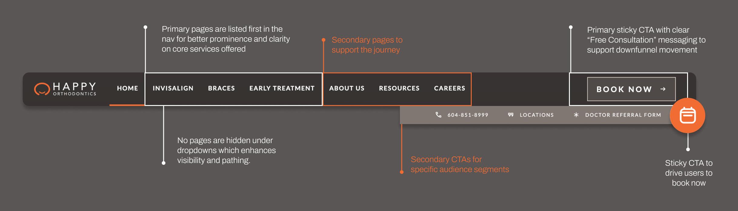
Using the content audit, the new information architecture was created to balance simplification, historical performance, and mirroring of the in-person consultation journey. The hierarchy was clear: choose a service, understand the process, review before-and-after examples, see social proof, and book a consultation. The structure reduced friction, clarified decision paths, and answered common questions earlier in the journey, guiding users toward booking with greater confidence.
.jpg)
The tech stack was built to be flexible, scalable, and low maintenance. Most components were configured to run on autopilot, reducing the need for ongoing technical support.For example, the Google Reviews widgets were configured to update automatically as new five-star reviews come in. The widget pulls in content dynamically without any manual input from the team or developer involvement. This keeps the website current and credible without requiring ongoing maintenance.

The biggest win from the website refresh was a +141% year-over-year increase in the proportion of users visiting the Book Consultation page. This signals very strong down-funnel progression and high intent to book now.
.jpg)