5X Festival
-min.png)
-min.png)
Following a successful website refresh with the Sparkbase team, 5X Festival identified a need for design support for their upcoming 2025 festival season.
Upon reviewing their strategic plan, it became evident that the current festival branding did not align with the niche audience they intended to target this year. This realization opened up an opportunity to develop a new festival sub-brand for 2025, specifically designed to connect more effectively with their audience while maintaining resonance with the parent brand.
-min.png)
The goal wasn't to overhaul the brand, but to test its boundaries. This involved extracting elements from the parent brand while creating a fresh visual identity that allowed for new growth.
We kicked off by looking wide. Our exploration spanned the branding from the past seven years, examined various other diasporic festival brands, and culminated in a moodboard that captured the right vibe. This research opened up the thought of incorporating Panjabi textiles and embroidery directly within the branding. Textiles patterns, like Khes, are elements that are part of everyday life but often overlooked in their complexity.
-min.jpg)
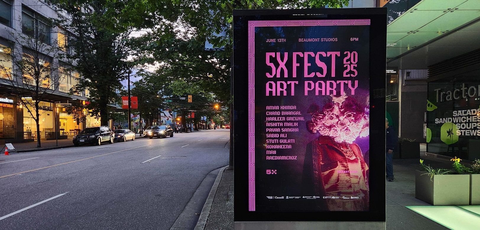
During the initial design phase, we realized that relying solely on textile patterns wouldn't fully engage our audience. While the brand is bold and edgy, the direction seemed more anchored in Panjabi culture than in the broader diaspora. This insight led us to organize a photoshoot aimed at capturing a hero shot. The creative direction was straightforward: blend traditional Panjabi elements with modern streetwear.

As the creative elements took shape, we shifted focus to mapping out the user journey. Drawing from previous years, the client team recognized that a combination of paid ads and organic social media would drive a significant number of users to the website, resulting in increased ticket sales.
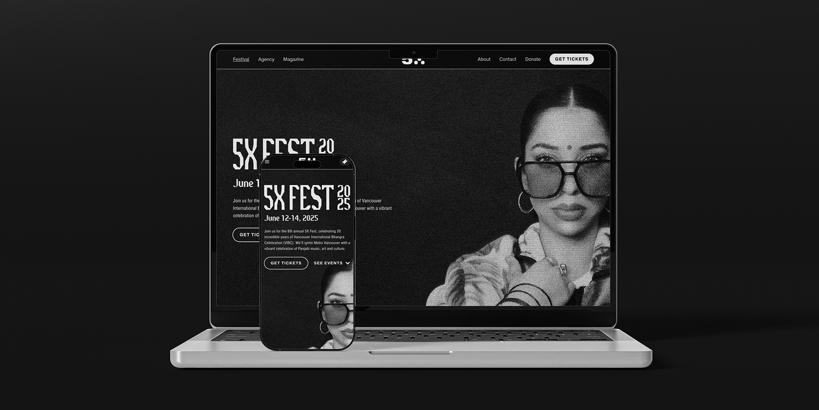
With these entry paths in mind, we designed the landing page to prioritize 'Get Tickets' CTAs, ensuring maximum conversion. The page also served as the central hub for festival information, which was organized in a clean, easy-to-navigate layout optimized for mobile-first traffic.
.png)
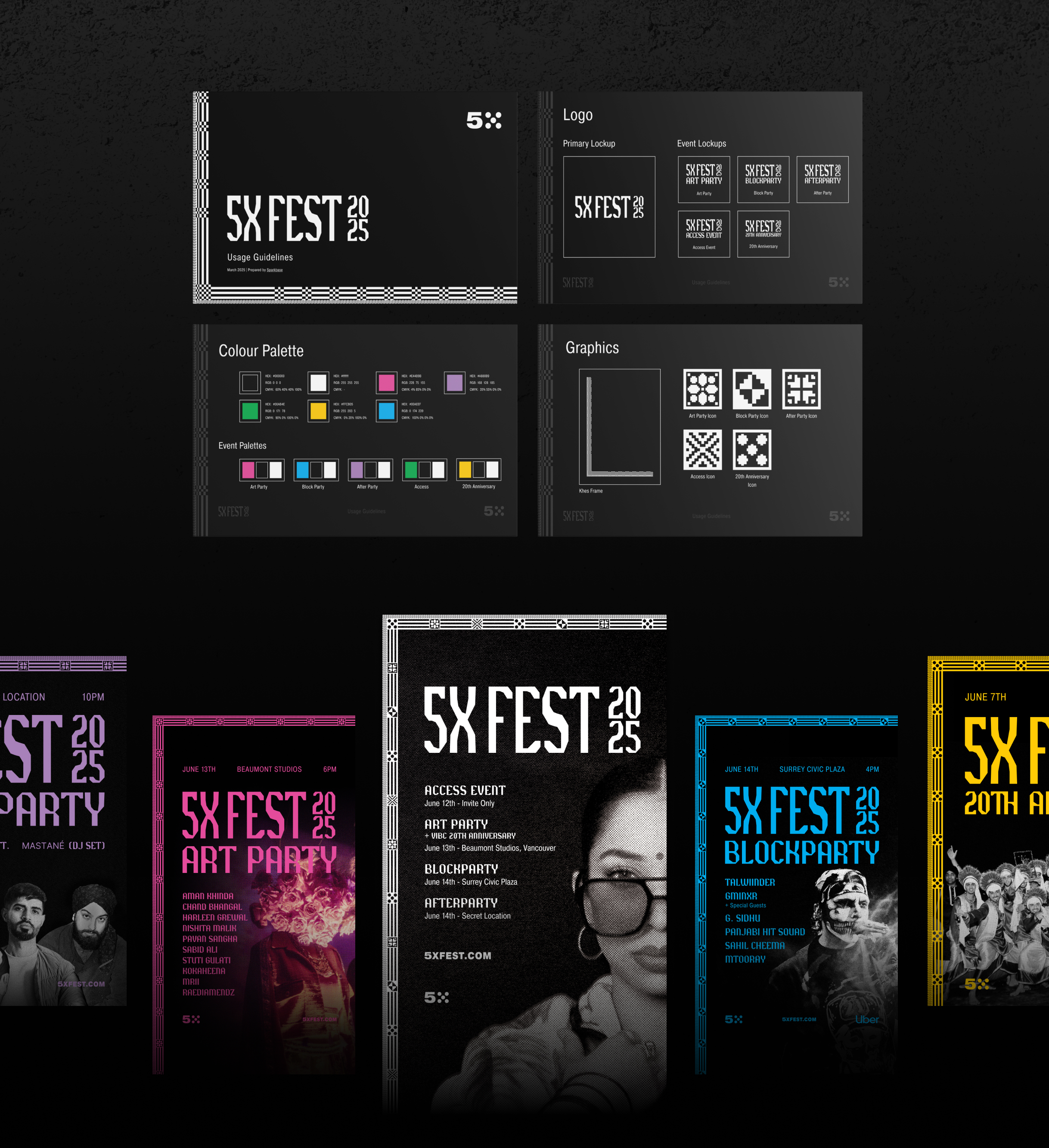
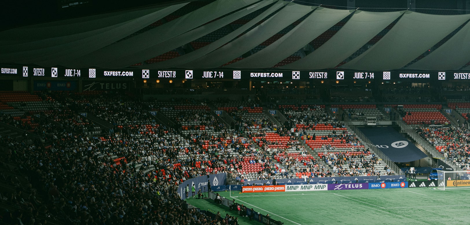
The brand system was specifically crafted to maintain cohesion while offering distinct identities for each event. All events were given their own iconography, colour palette, and lockup, which not only complemented the parent brand but also distinguished the events across digital and print media.
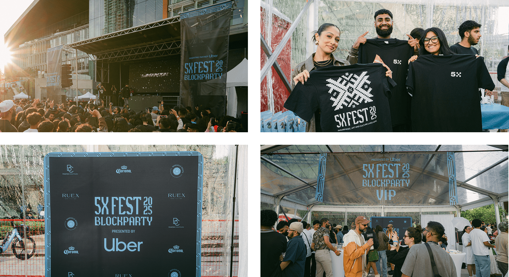
Across all 4 events in the lineup, the festival hosted a total of 8000 attendees.
5X is a non-profit arts organization for diasporic Panjabis.
Following a successful website refresh with the Sparkbase team, 5X Festival identified a need for design support for their upcoming 2025 festival season.
Upon reviewing their strategic plan, it became evident that the current festival branding did not align with the niche audience they intended to target this year. This realization opened up an opportunity to develop a new festival sub-brand for 2025, specifically designed to connect more effectively with their audience while maintaining resonance with the parent brand.
-min.png)
The goal wasn't to overhaul the brand, but to test its boundaries. This involved extracting elements from the parent brand while creating a fresh visual identity that allowed for new growth.
We kicked off by looking wide. Our exploration spanned the branding from the past seven years, examined various other diasporic festival brands, and culminated in a moodboard that captured the right vibe. This research opened up the thought of incorporating Panjabi textiles and embroidery directly within the branding. Textiles patterns, like Khes, are elements that are part of everyday life but often overlooked in their complexity.
-min.jpg)
During the initial design phase, we realized that relying solely on textile patterns wouldn't fully engage our audience. While the brand is bold and edgy, the direction seemed more anchored in Panjabi culture than in the broader diaspora. This insight led us to organize a photoshoot aimed at capturing a hero shot. The creative direction was straightforward: blend traditional Panjabi elements with modern streetwear.

As the creative elements took shape, we shifted focus to mapping out the user journey. Drawing from previous years, the client team recognized that a combination of paid ads and organic social media would drive a significant number of users to the website, resulting in increased ticket sales.
With these entry paths in mind, we designed the landing page to prioritize 'Get Tickets' CTAs, ensuring maximum conversion. The page also served as the central hub for festival information, which was organized in a clean, easy-to-navigate layout optimized for mobile-first traffic.
.png)
The brand system was specifically crafted to maintain cohesion while offering distinct identities for each event. All events were given their own iconography, colour palette, and lockup, which not only complemented the parent brand but also distinguished the events across digital and print media.
Across all 4 events in the lineup, the festival hosted a total of 8000 attendees.


Get your project started in just a few simple steps—we make it easy to move from idea to execution.