.svg)
Gladwin Optical
As Gladwin Optical marked 30 years of business in Abbotsford and Surrey, they decided it was time to refresh their brand and online presence, especially with a new location on the horizon.
Web Design
Marketing
Branding

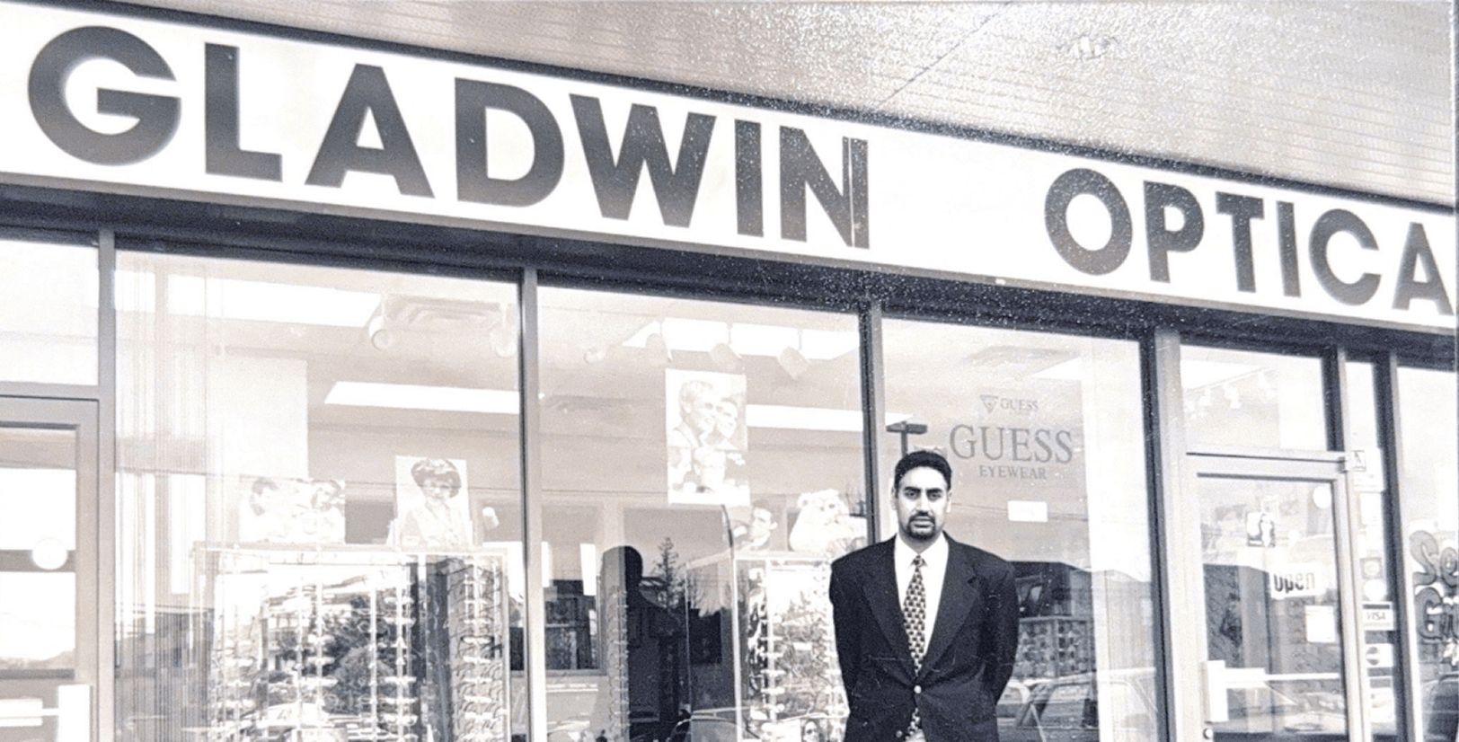
Gladwin Optical was nearing its 30th anniversary, a significant achievement for any family-run business. This milestone represented not just a celebration but the beginning of a new era of expansion. With a new location planned in Abbotsford, the company decided it was the perfect time to revitalize their brand identity and enhance their online presence.
The strategy for their new identity centered on two primary objectives. First, it was crucial to preserve the warm and inviting atmosphere that customers experience when visiting a Gladwin Optical location. As a family-run business, the client emphasized the importance of community. Second, they aimed to introduce a modern and minimalist aesthetic that would remain fresh and relevant for the next 30 years of business.

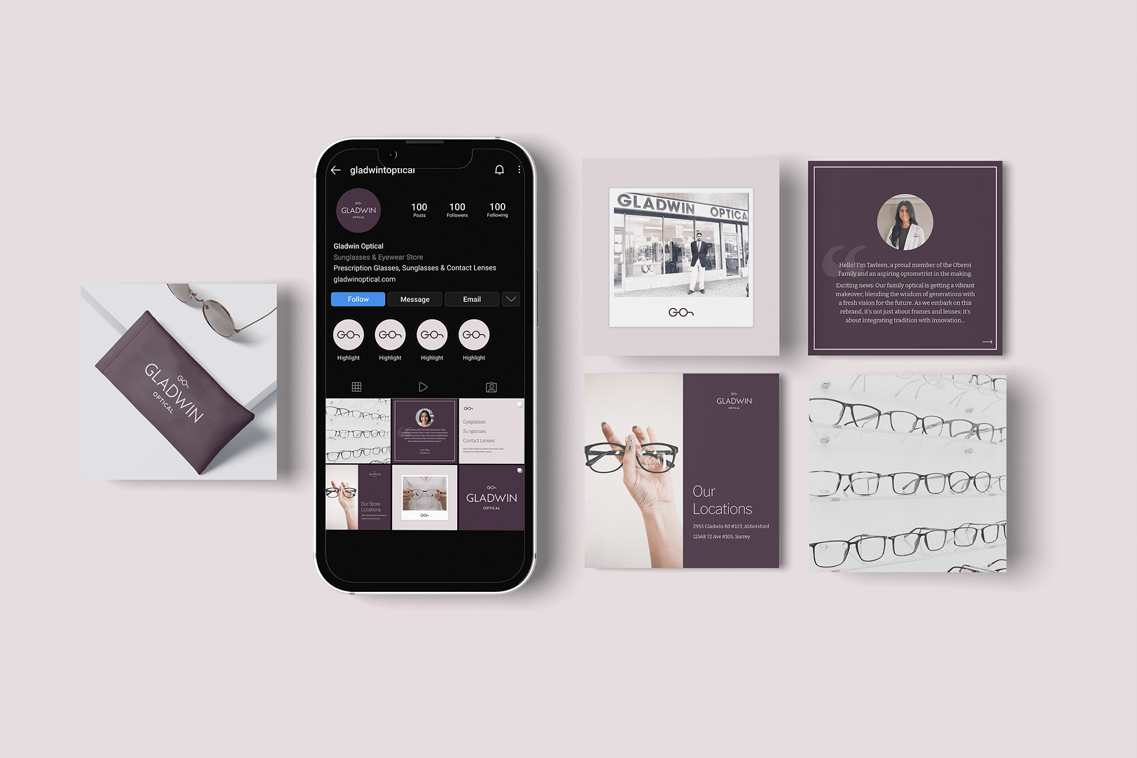
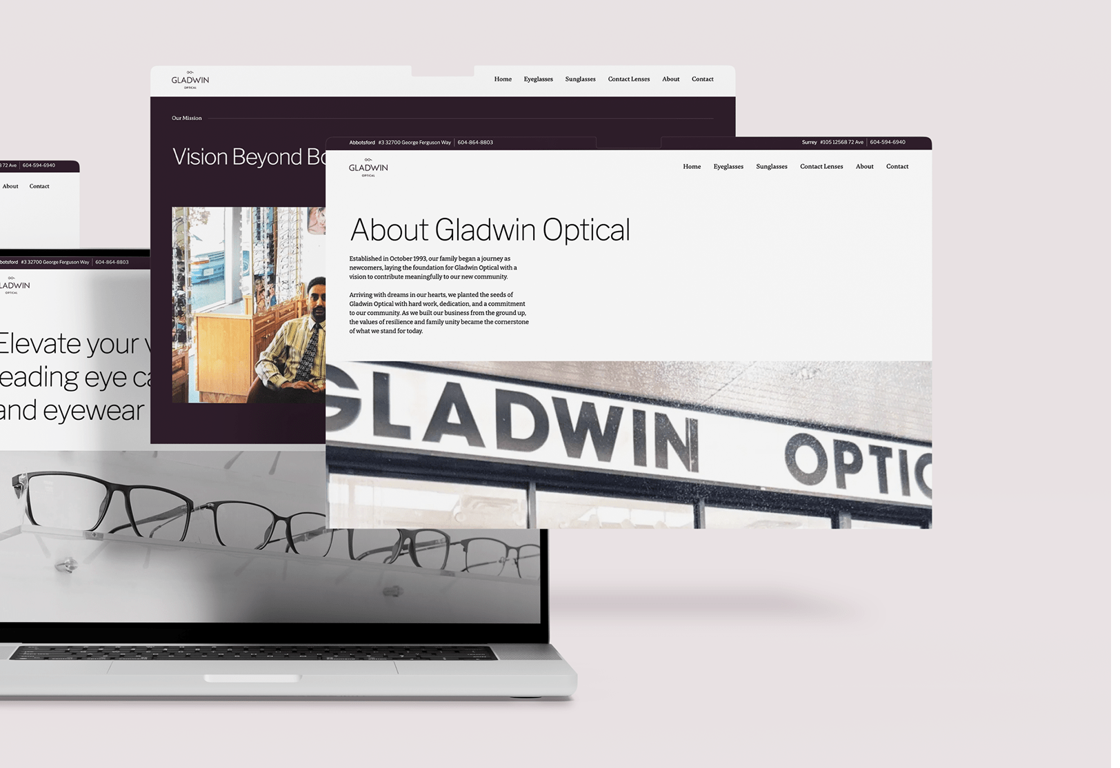
Our design concept cleverly turned the initials 'G' and 'O' into a glasses motif, highlighting the brand's main service. This was paired with a refined color palette of matte purple and soft light purple, achieving a balance between warmth and modernity. We also developed a library of social media templates, enabling the client's team to easily share updates and connect with their audience across their digital channels.
%201-min.png)
-min.png)


Gladwin Optical, founded in October 1993, is a family-operated eyewear and eye care provider with branches in Abbotsford and Surrey, British Columbia. For more than 30 years, they have been a reliable source for outstanding eye care services, including sight testing, corrective eyewear, and frame repairs.
Gladwin Optical was nearing its 30th anniversary, a significant achievement for any family-run business. This milestone represented not just a celebration but the beginning of a new era of expansion. With a new location planned in Abbotsford, the company decided it was the perfect time to revitalize their brand identity and enhance their online presence.
The strategy for their new identity centered on two primary objectives. First, it was crucial to preserve the warm and inviting atmosphere that customers experience when visiting a Gladwin Optical location. As a family-run business, the client emphasized the importance of community. Second, they aimed to introduce a modern and minimalist aesthetic that would remain fresh and relevant for the next 30 years of business.
Our design concept cleverly turned the initials 'G' and 'O' into a glasses motif, highlighting the brand's main service. This was paired with a refined color palette of matte purple and soft light purple, achieving a balance between warmth and modernity. We also developed a library of social media templates, enabling the client's team to easily share updates and connect with their audience across their digital channels.
Get your project started in just a few simple steps—we make it easy to move from idea to execution.