.svg)
samaracentre.ca
Samara Centre’s website was refreshed to enable high-volume content publishing and a lightweight, flexible UI making content discovery faster and clearer.
Web Design
-min.jpg)
The Samara Centre for Democracy initially contracted the Sparkbase team to assist with website management and new features, but discovery quickly showed they needed more than incremental updates. Layering new features onto the existing setup wouldn’t support their evolving goals and risked creating technical debt. What they required was a comprehensive solution—built for today’s needs and scalable for tomorrow.
Our initial discovery took shape as a variety of creative questions:
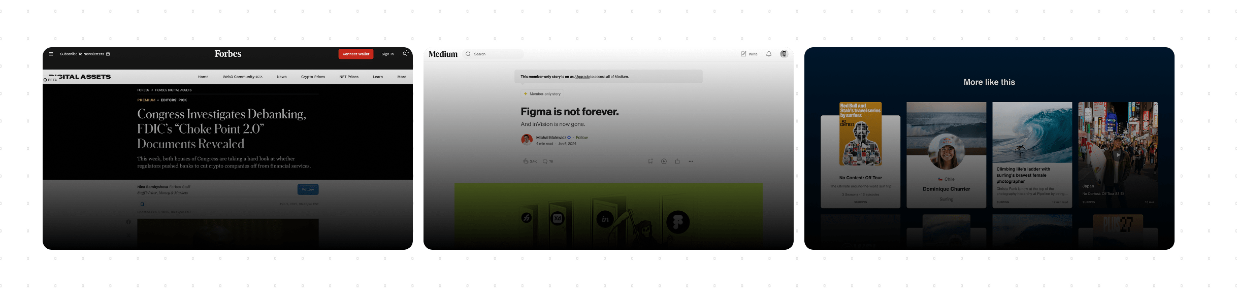
The new site design needed to be a content powerhouse. The team publishes frequently and at scale, so flexibility was key. To shape our approach, we analyzed how top news and media outlets visualize and structure large volumes of content. That research gave us the confidence that our design could handle heavy, detailed updates without breaking stride.
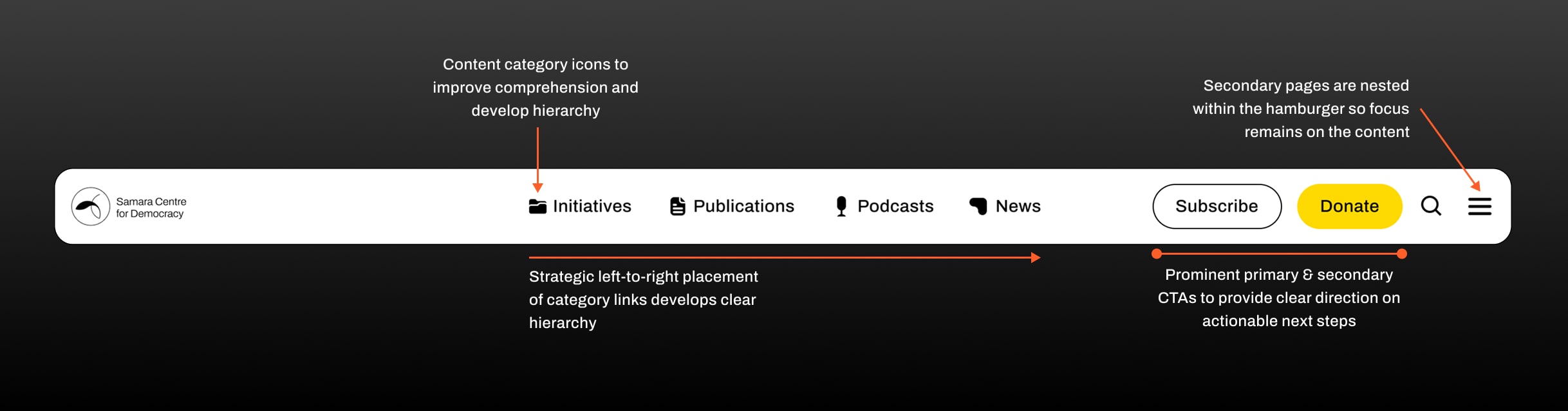
From there, we turned to Google Analytics 4 to see how users were actually engaging with the site. We tracked everything from navigation clicks to user flow and top-performing pages. The homepage was the main entry point, but most people were skipping straight to the Podcast menu while ignoring the "Our Work" dropdown. Insights like these confirmed the need for clearer, more visible content categories in the navigation.
To make sense of the existing architecture, we mapped out every page, URL, and on-page structure. The goal was to untangle the relationships between major projects (parent) and their related articles (child). This audit gave us a clear picture of how content connected—and where it didn’t—so we could rebuild the architecture in a way that felt logical, cohesive, and user-friendly. A thorough content audit also ensured that we'd be able to setup 301 redirects for any pages we decided to eliminate, refresh, or nest.
%201.svg)
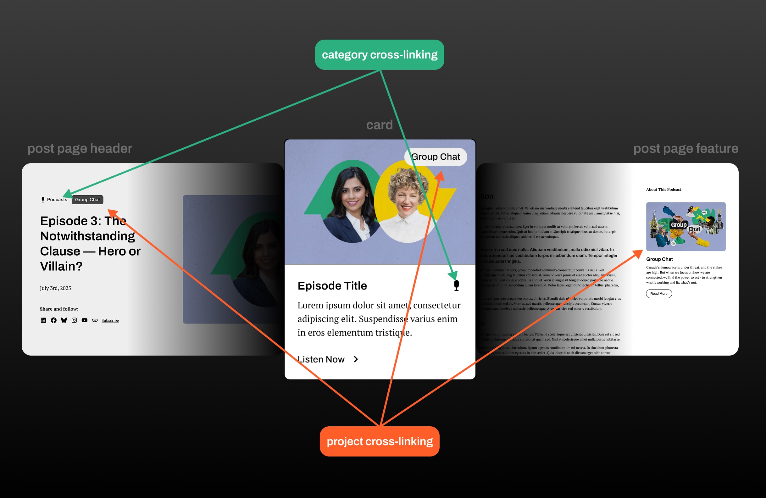
Armed with research, analytics, and input from the Samara team, we designed a new information architecture centered on flow and connectivity. Instead of keeping sections siloed, we emphasized how they work together. For example, Podcasts and Projects had previously been isolated. But since Projects often inspire Podcasts, we built in cross-linking and visual relationships across the UI and CMS. The result: content that guides users naturally from one piece to the next.
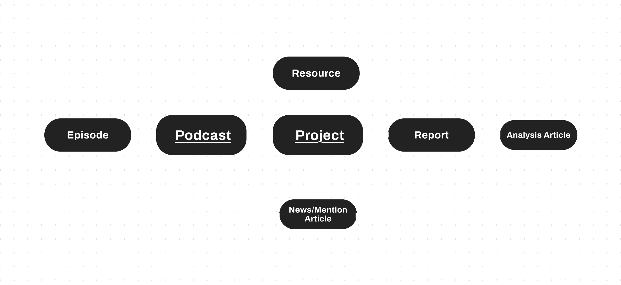
With structure in place, it was time to think about scale. Fragmented design had created inconsistencies, so we aimed to build a unified, component-based design system to keep everything cohesive. This involved mapping out global components aimed at structuring content such as cards, tiles, filters, tags, and breadcrumbs.
On the backend, we leveraged Webflow’s headless CMS. Headless CMS separates content storage from presentation, making it easy to design a layout once and repurpose it endlessly with fresh content. For the Samara team, that means managing high-volume publishing is faster, smoother, and more consistent for users.


The Samara Centre for Democracy is a non-partisan charity that produces ground-breaking research and dynamic events that advance a vibrant culture of civic engagement across Canada.
The Samara Centre for Democracy initially contracted the Sparkbase team to assist with website management and new features, but discovery quickly showed they needed more than incremental updates. Layering new features onto the existing setup wouldn’t support their evolving goals and risked creating technical debt. What they required was a comprehensive solution—built for today’s needs and scalable for tomorrow.
Our initial discovery took shape as a variety of creative questions:
The new site design needed to be a content powerhouse. The team publishes frequently and at scale, so flexibility was key. To shape our approach, we analyzed how top news and media outlets visualize and structure large volumes of content. That research gave us the confidence that our design could handle heavy, detailed updates without breaking stride.
From there, we turned to Google Analytics 4 to see how users were actually engaging with the site. We tracked everything from navigation clicks to user flow and top-performing pages. The homepage was the main entry point, but most people were skipping straight to the Podcast menu while ignoring the "Our Work" dropdown. Insights like these confirmed the need for clearer, more visible content categories in the navigation.
To make sense of the existing architecture, we mapped out every page, URL, and on-page structure. The goal was to untangle the relationships between major projects (parent) and their related articles (child). This audit gave us a clear picture of how content connected—and where it didn’t—so we could rebuild the architecture in a way that felt logical, cohesive, and user-friendly. A thorough content audit also ensured that we'd be able to setup 301 redirects for any pages we decided to eliminate, refresh, or nest.
Armed with research, analytics, and input from the Samara team, we designed a new information architecture centered on flow and connectivity. Instead of keeping sections siloed, we emphasized how they work together. For example, Podcasts and Projects had previously been isolated. But since Projects often inspire Podcasts, we built in cross-linking and visual relationships across the UI and CMS. The result: content that guides users naturally from one piece to the next.
With structure in place, it was time to think about scale. Fragmented design had created inconsistencies, so we aimed to build a unified, component-based design system to keep everything cohesive. This involved mapping out global components aimed at structuring content such as cards, tiles, filters, tags, and breadcrumbs.
On the backend, we leveraged Webflow’s headless CMS. Headless CMS separates content storage from presentation, making it easy to design a layout once and repurpose it endlessly with fresh content. For the Samara team, that means managing high-volume publishing is faster, smoother, and more consistent for users.
Get your project started in just a few simple steps—we make it easy to move from idea to execution.